New Logo For The E.A.T.S. Community
The Challenge
Create a logo for The E.A.T.S. Community, a new type of organization that seeks to make us all #HungryForHealthyIn60Seconds. The Logo will be used for every aspect of this new media venture and has to be simple but efficient.
The Solution
I am so proud to be able to bring the entire creative support of On Location to a new passion project that I am creating with my amazing partner Jane Park Smith. The Logo is only the beginning. On Location will be providing everything from writing, editing, voice over, field recording, Camera support, directing, and as a producer of media I will also be a Creative Director to keep this project moving forward.
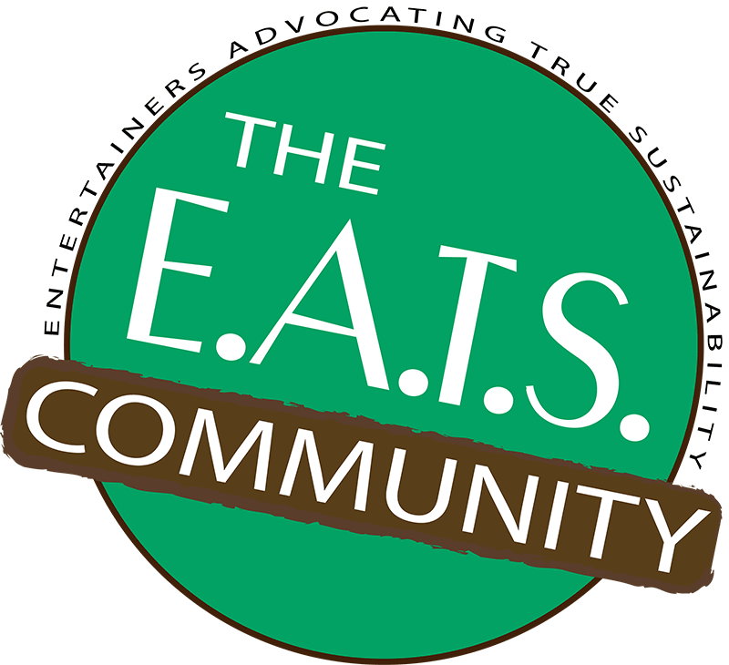
The Logo is made of two colors. Green to represent the focus on natural food and “going green” and brown to represent earth and trees. The entire name surrounds the circle that represents “community”. The logo is a bit of a seal of approval that we will be putting on our visual projects and it will be displayed all across the various social outlets that On Location will be setting up.